What print conventions and mthods were used in designing and laying out your
product?
On my double page spread for the magazine i choose to a big tittle to draw the reader in. I also added lots of colour so the page stands out. I used alot of images with my small stories so that the story is broken down for the reade.
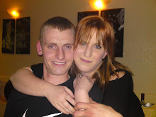
On the tittle line i used a picture of myself so the reader knows who is writting the stories.
On my newspaper stories i choose to use big headlines. I colourco ordinated some of my stories. I included alot of photo's to enable the viewer to have a sense of reality.
On my speacialist page i used a headline and a small intro to enable the viewers to get a sense of the story. The colours i used in my speacialist page matched the colours of what we were wearing.
How well did your design adhere to your initail concept?
Originally i wanted to use a story from the court room. Unfortunatelly the stories at the court had know relevance to the magazine. I had to change my stories. Originally i though i had more stories than what i did unforunately i did not so alot of stories had to be wrote.
My page layout looked amazing and i originally wanted it to look like that. I feel that other than the stories it all went to plan.
How did the design appeal to your target audiece?
I feel that in general my target audience liked the work i did. I fee that the females preffered it to the males. I had very positive feedback from a questionairre i set for people.
How was the technical quality?
I feel that the technical quality went well. I think that my front page could of done wih a little less white space. I would have felt better if the tittle on my celeb page was colour. Unfortunately it could not be changed because it was imported as a picture.
Readership feedback
In my folder i have inclded feedback from the students that have looked at my publications. I feel that all my feedback have very positive remarks and i truly have listened to every bit of feedback.